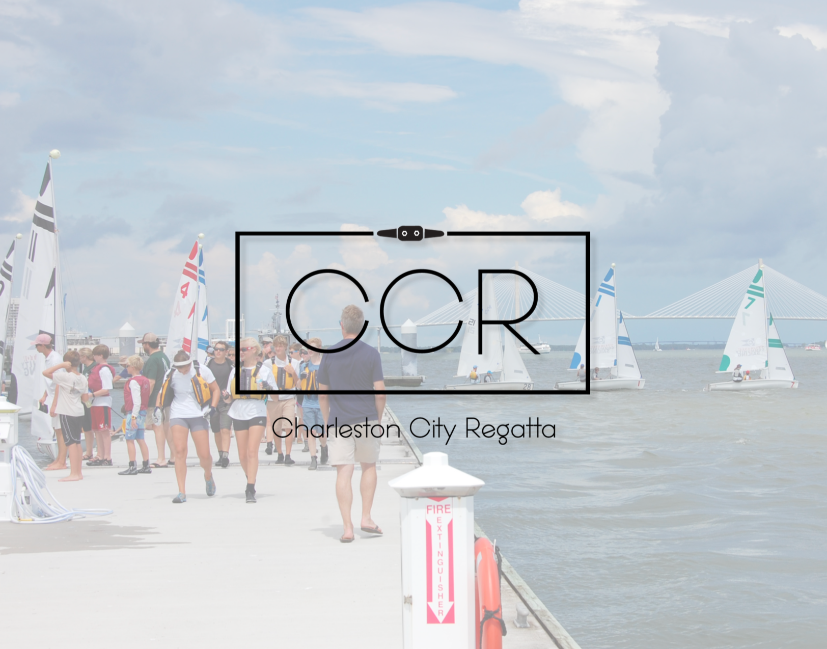

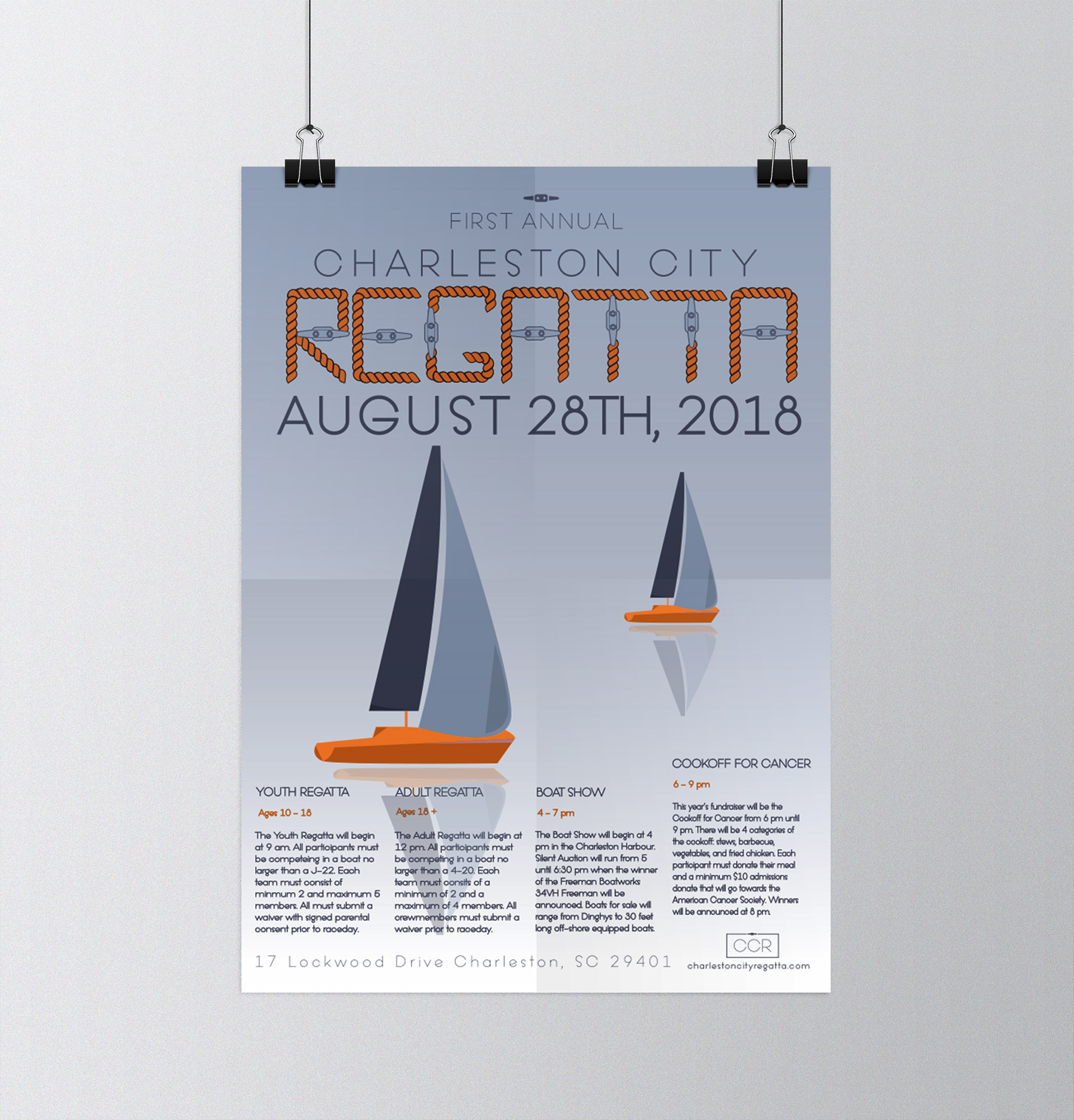
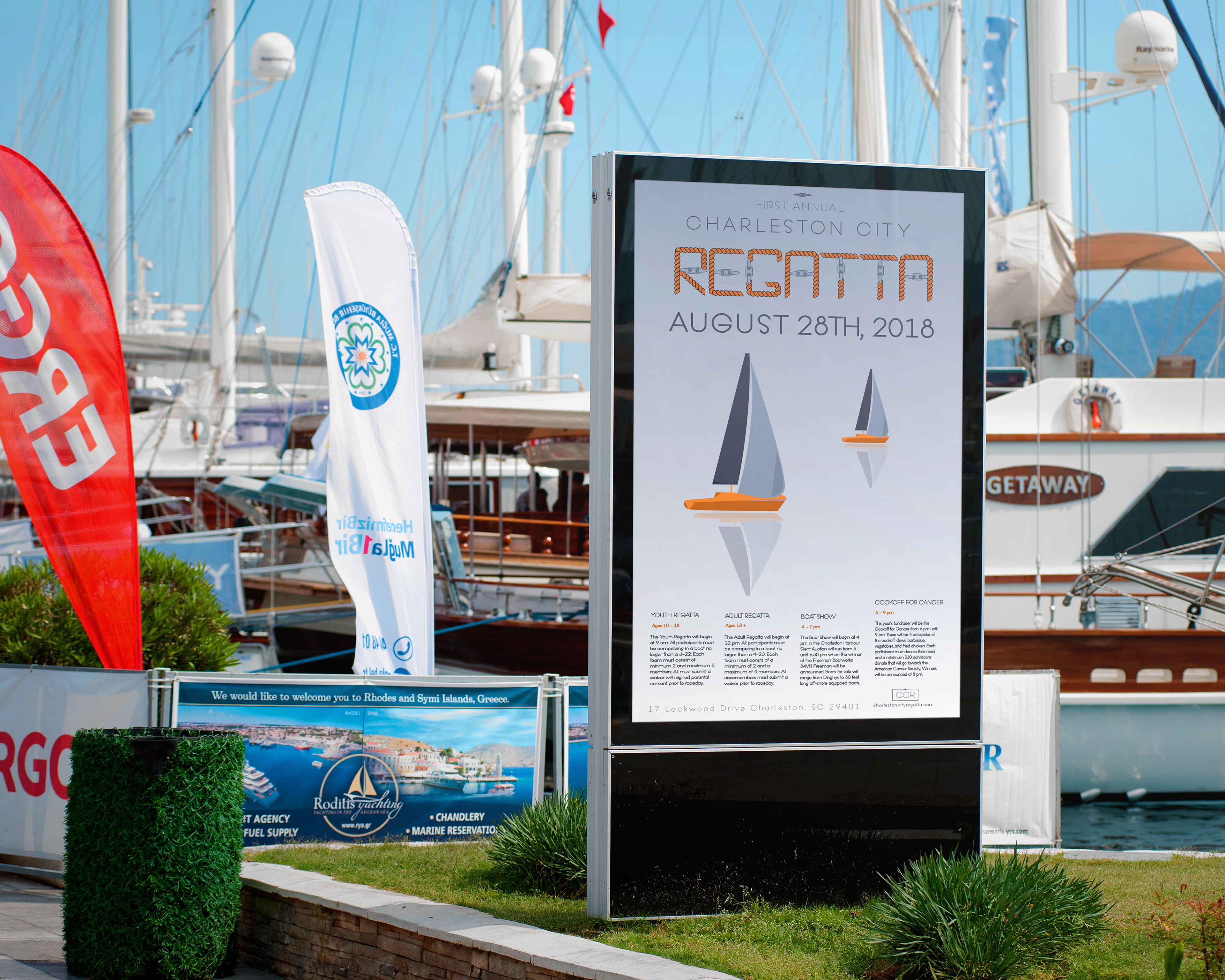
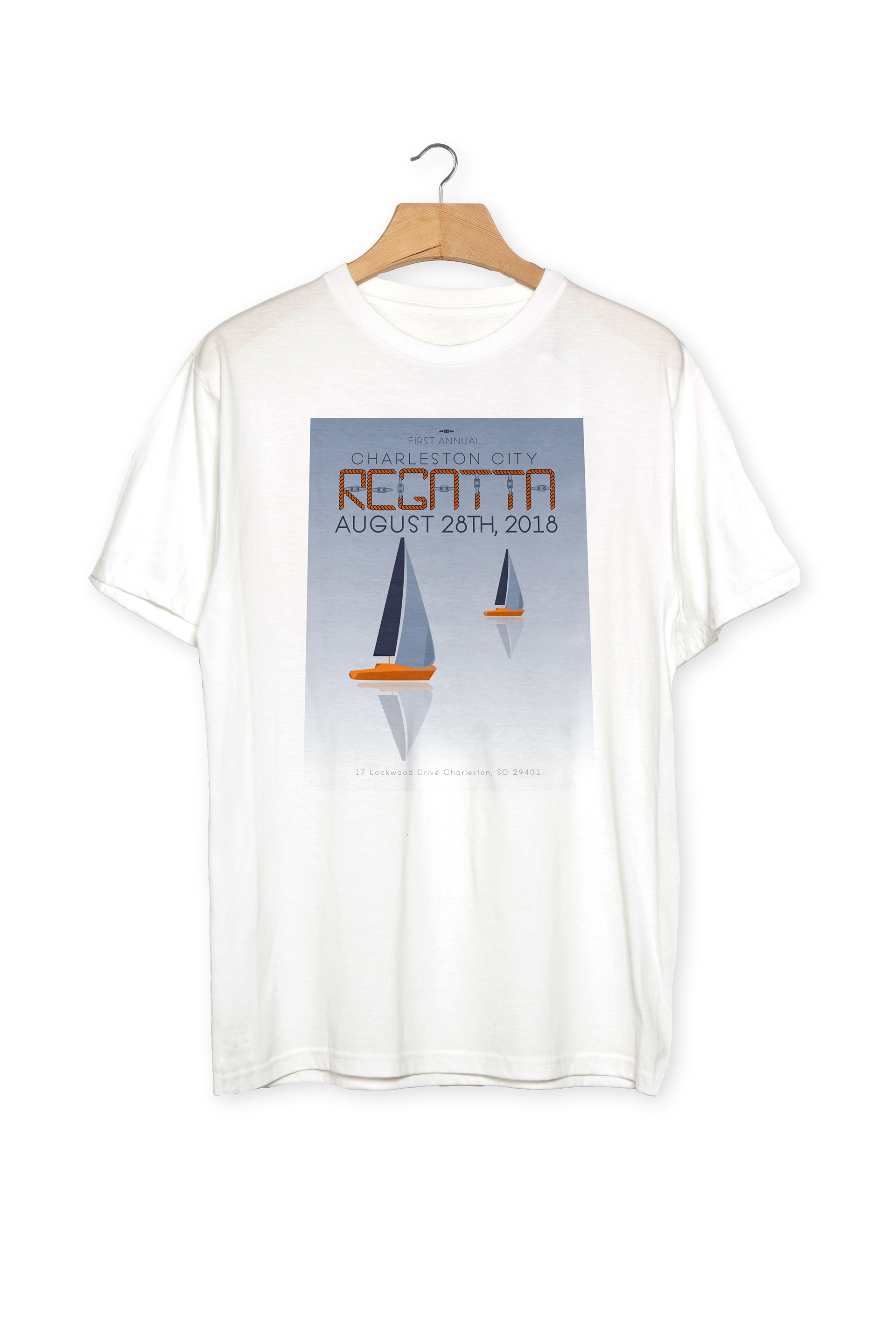


The inspiration behind the modular typeface “CC Regatta” was a desire to bring back to life an event that at one time tide the ocean to the city of Charleston. A simple logo in necessary to re-brand this event. This logo uses the cleat icon to bring together the event with the typeface. Branding for this event included a main poster, event tents, and t-shirts that can be used every year. On the t-shirt for this year’s event is the poster which uses the special typeface “CC Regatta.” This typeface is in all capital letters and uses the cleat element in the crossbar and stem one time in each letter. The rope connects the letters just like a boat would tie up to a dock. This typeface is meant to be used for all things nautical. The navy and orange colors were choen to represent the water and a beautiful Charleston sunset that will also catch the attention of Charlestonians to reminisnce on days spent on the water.