

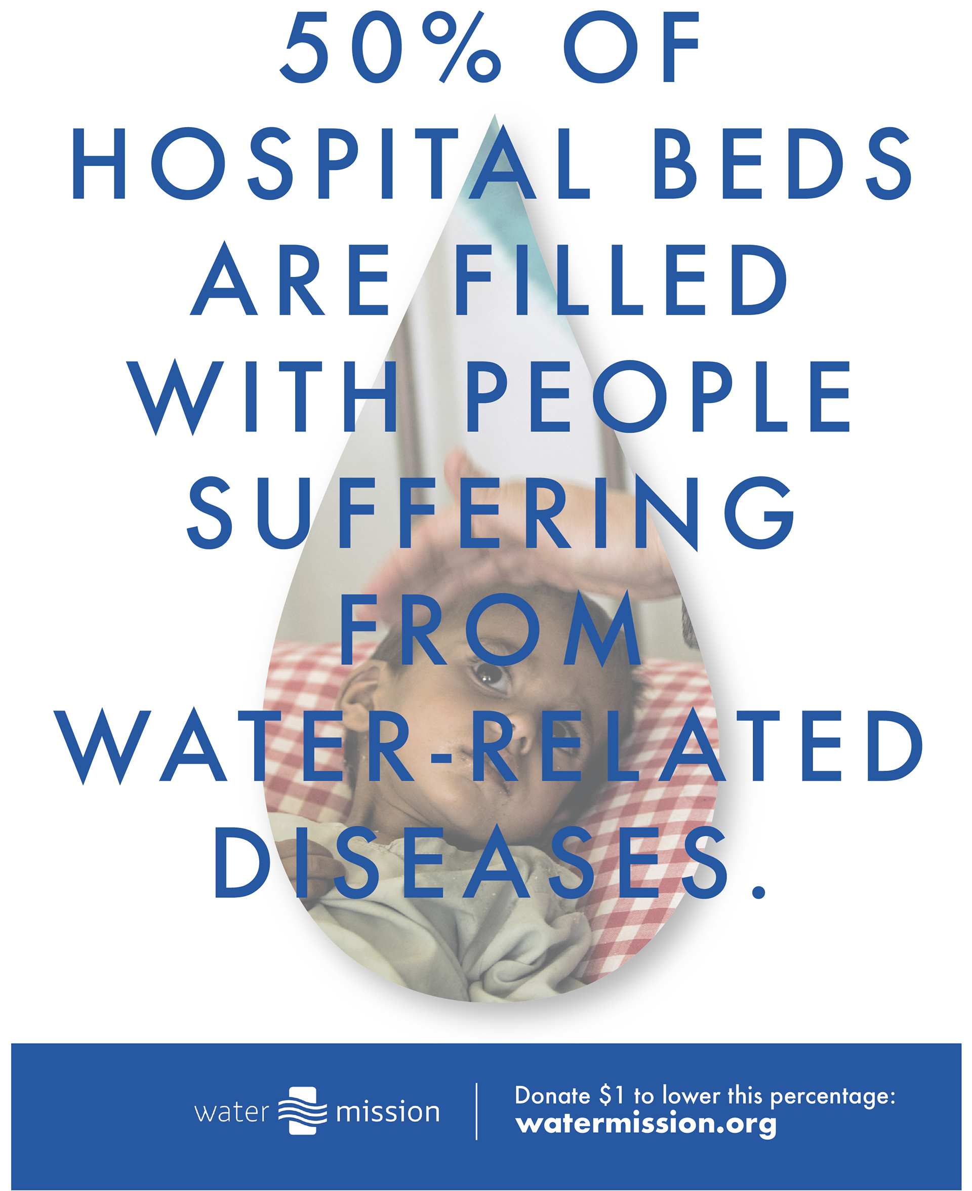
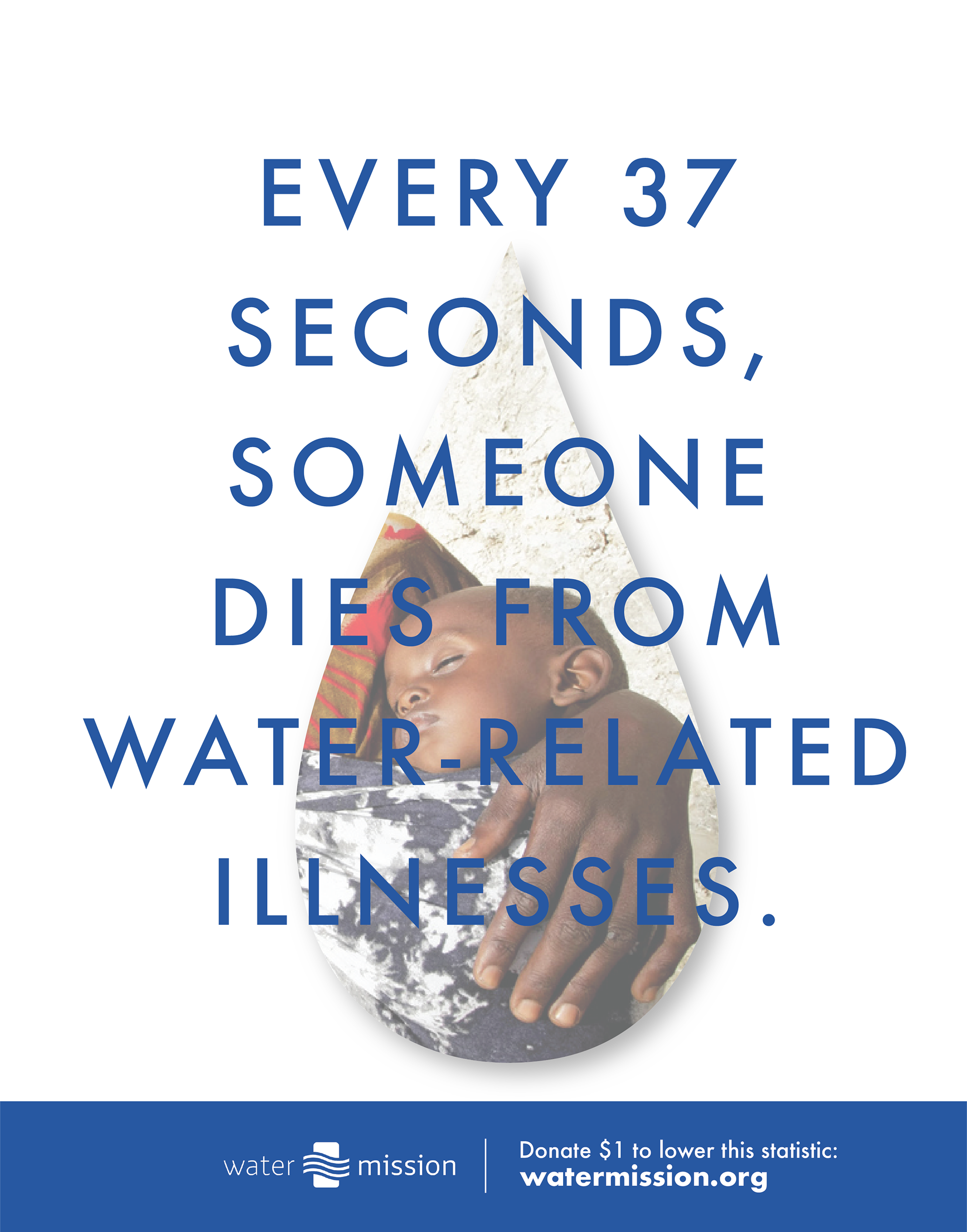

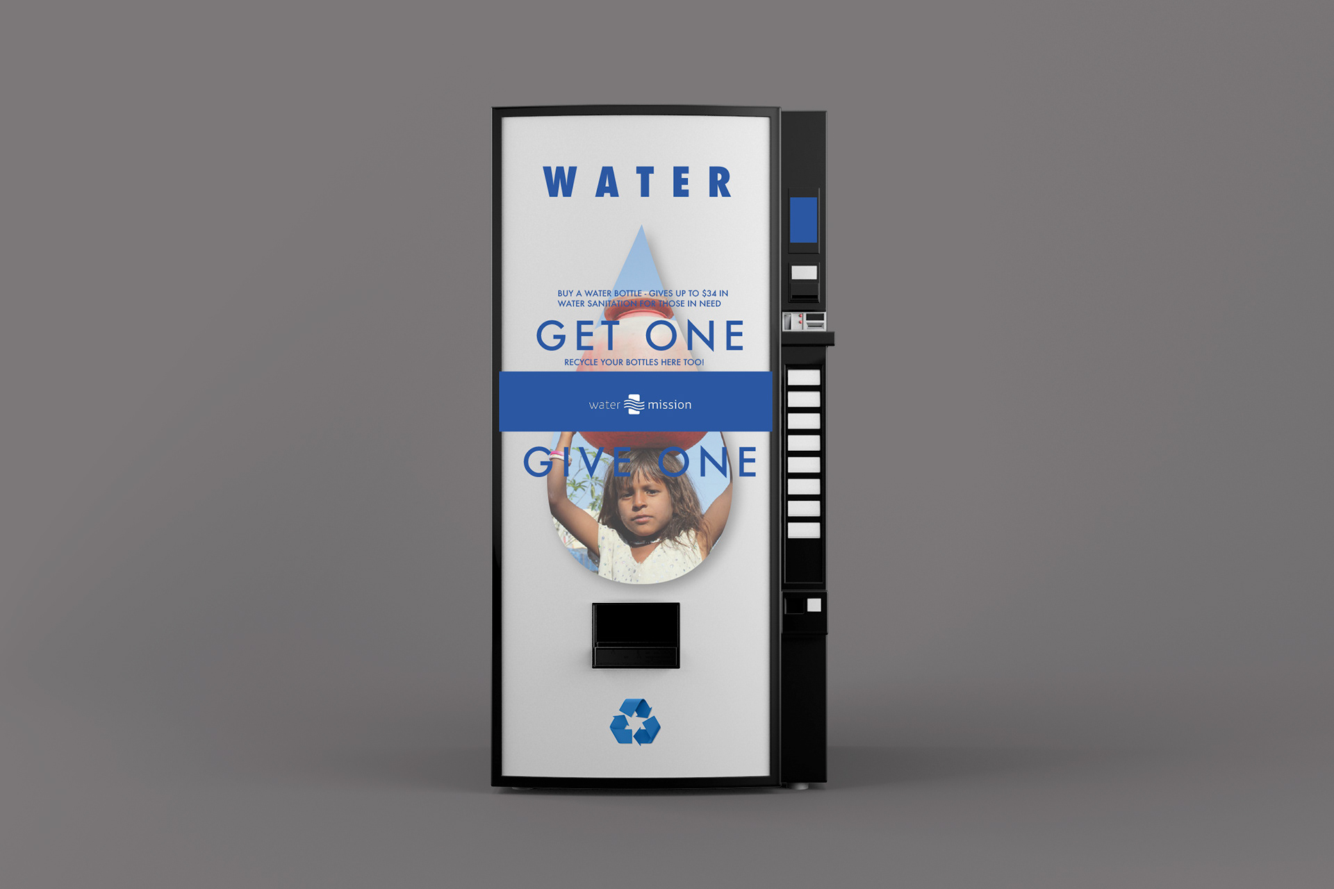
The Design Rationale for the Water Mission Campaign begins with the idea that every person matters and everyone can make a difference in the water sanitation issues in the world. This company shows startling statistics on their website but have no forms of advertisements that use these statistics to grab the attention of people that could get informed and involved. The colors for this design came from the logo and website - blue obviously because of it’s life-giving and important relationship with the one element we all need and what this organization is all about: water. The photos followed the creative brief with their harsh reality but were not the focal point of the design, rather, the words were and then the call to action in the bottom blue area. The idea behind the vending machine is to raise awareness of just how simple getting involved can be. For every bottle of water that is purchased (costing $1), the equivalent value in the community chosen by the buyer is donated towards water sanitation, whether that be for hurricane relief or a third world country. This vending machine also provides the users with the opportunity to recycle their empty bottles so that they can be re-purposed by the company and not bring more waste into the world. The idea behind the social media campaign is to promote the annual “Walk for Water” that the organization puts on where people raise money and carry a bucket full of water the average distance that people in third-world countries walk to get clean water (3.7 miles). Through the sticker promotion (costing $1) and social media campaign of #W4W, awareness for not only the event but also the organization and just how much they can do with $1 if people take the time to get involved and donate to Water Mission International.